
Working with Styles in Mellel
Mellel is a powerful word processor for those of us who need to write long works that include cross references, bibliographies, internal citations, tables of content, and whose contents require carefully structured parts, sections, and subsections. And it’s unsurpassed for working with multiple languages in a single document – particularly if one or more of those languages are Middle Eastern. Mellel provides comprehensive tools for creating, organizing, and applying text styles, but it takes some thought to get it right. Here are some guidelines.
Unstructured
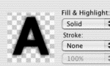
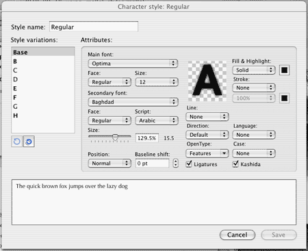
Unstructured documents are the easiest to jump into, but easier to fall prey to stylistic inconsistencies. I almost never use them. In this method, all you need are the Main and Secondary Font pallettes, the Character Appearance, Alignment & Spacing, and Margins & Tabs pallettes. Main Font determines the primary font in which your document’s text will be rendered. You can choose a font (e.g. Optima or Lucida Sans), a Face (e.g. Regular, Bold, Italics), and a Size (e.g. 12 points). It will remain consistent through your document. The Secondary Font pallette is important if you’re writing using two different languages and scripts in the same document, for example an English language paper using lots of Arabic words. Arabic in this case is your second script, and here is where you set its characteristics. Its most interesting feature is the "Size" feature, which lets you, for example, print all the Arabic letters slightly bigger than they’d be shown normally given the characteristics of the font. The Character Appearance pallette allows you to control characteristics like color and strangely enough, underlining.
Option 1: Force Paragraph and Character Style Linkage
To make your headings stand out you need to define a paragraph and character style for each (the settings are distributed among the Alignment & Spacing and font pallettes), and by linking you associate them. The Paragraph Style pallette allows you to choose alignment and how much space to insert before and after the line, among other options, and the Character Style allows you to select the options you’d find on the Main Font and Character Appearance tabs. Ideally, you link them together for convenience.
So, create a "Heading 1" character style. For any heading we’ll want a heavy, bold font, so choose something like Optima Bold 12 point. Then create a "Heading 1" paragraph style. For example, we’ll choose a 1 cm space above and below the heading line, and left align the text. Now comes the key to this style technique: select "Heading 1" as the "Associated Char Style." Now whenever you choose a Heading 1 paragraph style, the right font will be used. You can repeat this for a Header 2, for example choosing a paragraph alignment with a bit of indentation, and a slightly smaller font, and link Header 2 paragraph style with the Header 2 character style.
Lastly, I like to have keyboard shortcuts for my styles, and to do so you don’t use the palettes, you use "Edit Style Sets" from the top menu.
Option 2: Loose
In this option, you don’t tie the Paragraph Styles and Character styles together, and rather define sets of characteristics that can be reused. For example, create a paragraph style that sets lines flush left with no indent and call it "Flush Left," and another with an indent called, "Indent Left." Paragraph styles for headings will require more spacing above and below the line, and titles and subtitles more space still. For character styles, create two or three: one for regular text, one for titles, and one for headings (for example: Arial 18 bold for titles, Arial 14 Bold for headings, and Times New Roman 12 for the body text). Then mix and match as you wish. For example, your first level of headings could be a centered paragraph style with the headings character style, while your second level of headings could be a flush-left paragraph style with the same character style. Better still, define these choices using Auto-Titles. See the next section.
Character Style Variations
A word about character styles: you are allowed several variations, and it took me some time to decide how best to use them. In the end, I find it’s best to use them for certain kinds of words. For example, variation B can be the same font but in Title Case, and you use it for the occasional word that requires title case, like for proper nouns. Later, if you decide you’d rather use another format for proper nouns you can change them en masse. You can just as easily create a variation that is shown as italics, rather than pressing control-I every time you want italics. If you ever change your mind and decide those words should be bold rather than italicized, it’s easy to modify.
Structured (Auto-Titles)
If you have extensive sections and subsection, and require a table of contents, you need to use Auto-Titles to create them. Auto-Titles have more innate logic embedded within them and Tables of Contents incorporate them automatically. Honestly, I find that Auto-Titles are necessary for organizing long documents. But they’re a bit intricate and take lots of fiddling. You can create different auto-title schemes according to your numbering and labeling needs. For example, a book might have Parts (A, B, C), Chapters (1, 2, 3), and Sections (unnumbered), while a small essay will have Sections (I, II, III) and Sub-Sections (un-numbered). Mellel lets you create and save these "auto-title set ups" and then apply them at will.
The first complication is that each auto-title needs to be formatted, and you need to associate them with paragraph and character styles. This implies that to guarantee a document maintain a certain look you need to define both an auto-title setup and a style set, and use them together.
The second complication is the fact that for each level of heading you can design separate looks for the heading where it appears in the text, in the Table of Contents, in cross references, in the outline panel, and in "Mentions" (running headers). That’s a lot of work, but allows you to really determine in advance what your document will look like, and you only have to do it once. This task becomes unbearable if you design your document using non-standard styles, so take the time to do it right and you will save time and hassle over all. The recommended order is: define your character styles, then your paragraph styles, then do the same for the styles you intend to see in your table of contents. Then open the auto-title dialog and apply them.
Note that as you work with and modify an auto-title setup, your changes are not saved back to the auto-title setup automatically. As such, you can change to a different auto-title setup, then back, and lose your changes. Within the Auto-Title setup dialog box, you must re-save the setup in order for those changes to the setup to be repeated across similar documents.
Summary: I find setting up Mellel styles to be pretty tedious because there are so many options and so few of them are set up in advance. But I truly appreciate the ability to define the look of my documents with such precision, and I furthermore appreciate the fact that the styles will be respected. There is no other word processor out there that gives you the precision Mellel does to make your complex, technical work look like a star. And if you have the misfortune of spending lots of time reading ugly, inconsistently-styled papers, a well-designed document of the sort Mellel can produce is a breath of fresh air.
Trackbacks
The author does not allow comments to this entry
Comments
Display comments as Linear | Threaded